The Corporate Design of TU Dortmund University
Just as every person has an unmistakable identity, the corporate design gives Dortmund University of Technology an unmistakable profile. It ensures recognition and efficient communication. The task of the corporate design and the premise for every design as well as all means of communication is to give the profile of the TU Dortmund University visible contours and to make it tangible everywhere.
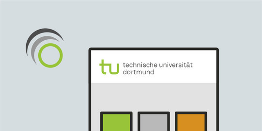
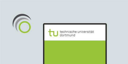
The fixed and unchangeable basic elements of TU Dortmund University's corporate design are the logo, the colors, the corporate typeface and the protective zone. Their consistent application translates the profile of TU Dortmund University into a concise language of form and design.
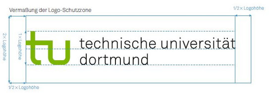
The size of the media protection zone is optimized for the different logo sizes and borders the top and left of the format edge.
Around the logo there is a minimum free space, called "logo protection zone", in which no graphic elements, texts, color areas or images may be placed. At the same time, the logo protection zone indicates the minimum distance to the format edge. It applies to all media - from business stationery to the homepage to orientation signs. This value is the absolute minimum and may not be fallen short of in any case.
You can find the concrete placement specifications in the PDF of the Corporate Design Manual.
TU Green Spot Color
PANTONE 368 C
TU Green CMYK
57/0/100/0
Accent color orange
0/55/100/0
TU-Green
#639A00
Accent Color Orange
#CA7406
TU-Green
132/184/25
Typeface is a unique visual selling point. That is why it is important that the typeface speaks the language of the institution and is anchored in the corporate identity. Together with color, form and image, typeface is one of the four pillars of corporate design.
Since 2021, "Akkurat LL" has been used as the house font. It has an extensive range of special characters, languages and can be used universally as an "OTF" file in Adobe programs as well as in Microsoft Office, on MAC OS and Microsoft Windows systems.
The "Accurate LL" is a central element of all communication tools. It is one of the most important aspects of the visual identity and has a clear and open look that is recognizable and very legible. It has all common characters and accents and is therefore versatile.
Principles
"Akkurat LL" is to be used for print media of TU Dortmund University. The font styles may not be changed electronically in any way. This means that font width and markings remain untouched.
The typeface can be ordered from the University Marketing Department.
Information materials (brochures, flyers, posters, online information, etc.) about the Technische Universität Dortmund and its institutions correspond in their external design to the corporate design of TU Dortmund University and are to be coordinated with the University Marketing Department prior to their publication or mailing.

